Obviously you’ll need ggplot2 installed in your R environment to do this. I’ve also generated some bogus data just to keep things simple for this.
library(ggplot2)
FullData <- data.frame(
  name = c("Alice", "Bob", "Charlie", "David"),
  score = c(42, 37, 91, 58),
  food = c("pizza", "tacos", "pizza", "burger")
)
print(FullData)
     name score   food
1   Alice    42  pizza
2     Bob    37  tacos
3 Charlie    91  pizza
4   David    58 burger
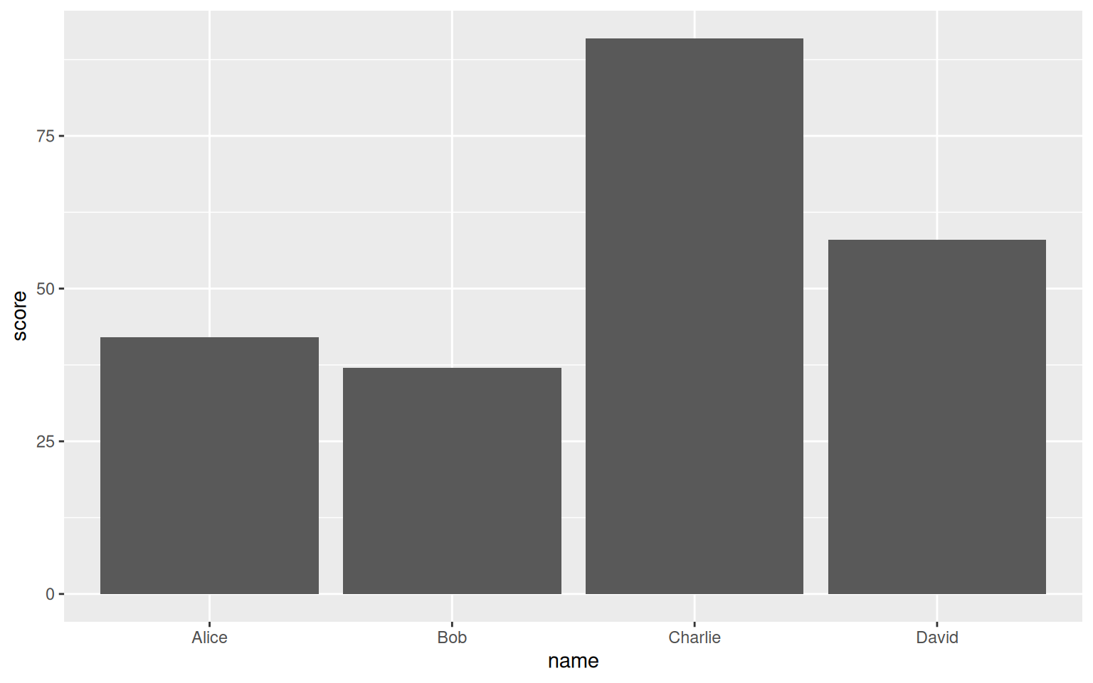
The easy way to generate a basic bar chart is as follows, which most of you should know by now.
ggplot(data=FullData, aes(x=name, y=score))+
  geom_col()
Now let’s say I want to color-code them to each type of food, with the following order: blue for pizza, red for tacos, and green for burger.
The easiest way to accomplish that is simply by manually assigning it in the “fill” field by combining them all into a vector (vectors are when you use a c(1, 2, 3) to define a list of values), listing the colors you want from left to right, as I have done below.
ggplot(data=FullData, aes(x=name, y=score))+
  geom_col(fill=c("blue", "red", "blue", "green"))
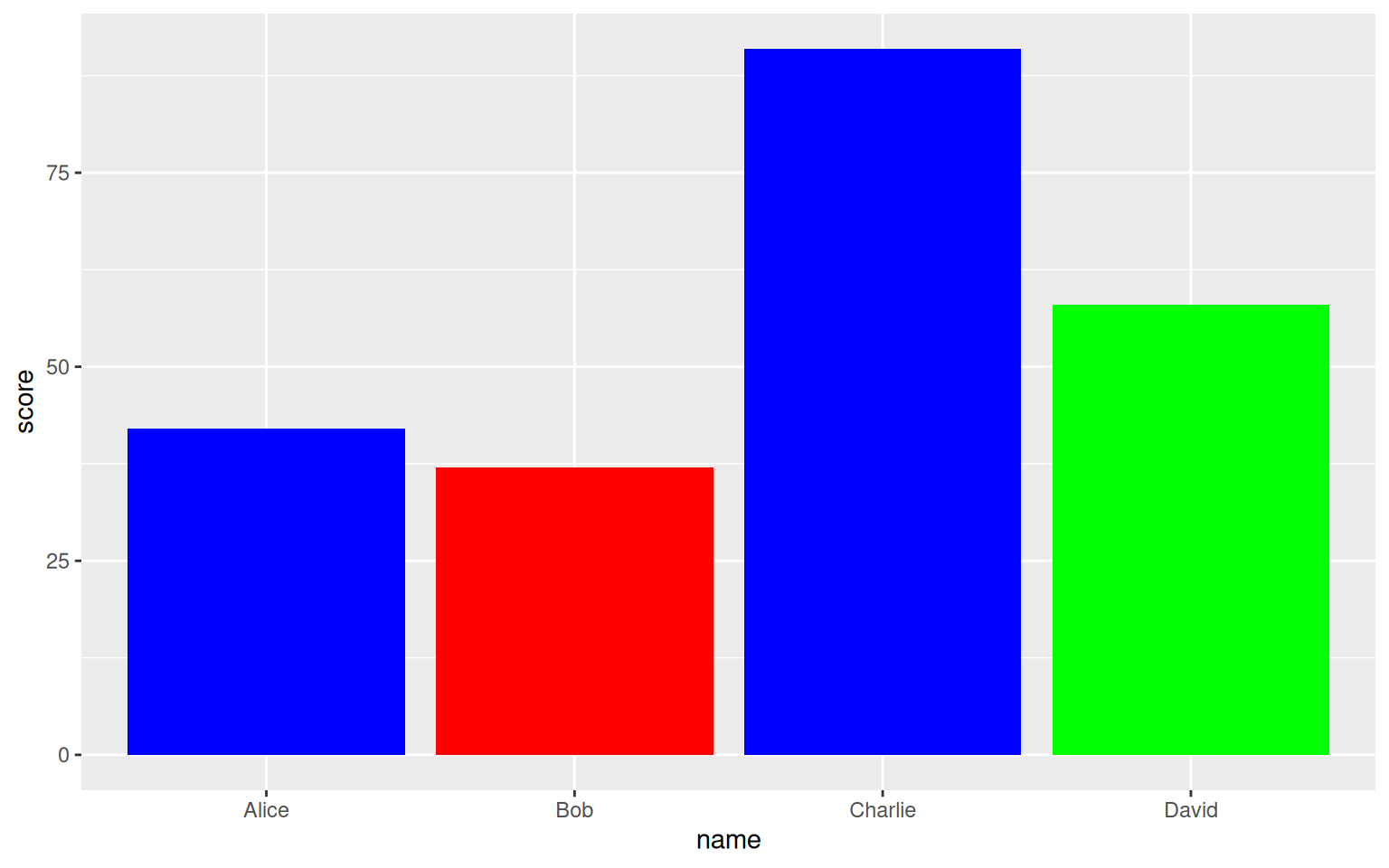
Now this does work, but there isn’t a key on this graph, so viewers have no idea what the color means in the first place. Likewise, since the colors are hard-coded, if any one person’s food changes or we insert someone else in the middle, we have to manually adjust the list of colors to prevent blank/misassigned entries.
Instead, we can use the aesthetic mapping (values stored in the aes(field1=data1, field2=data2) format that tells ggplot how to use data-driven variables to describe your graph), specifically for the “fill” value field.
ggplot(data=FullData, aes(x=name, y=score, fill=food))+
  geom_col()
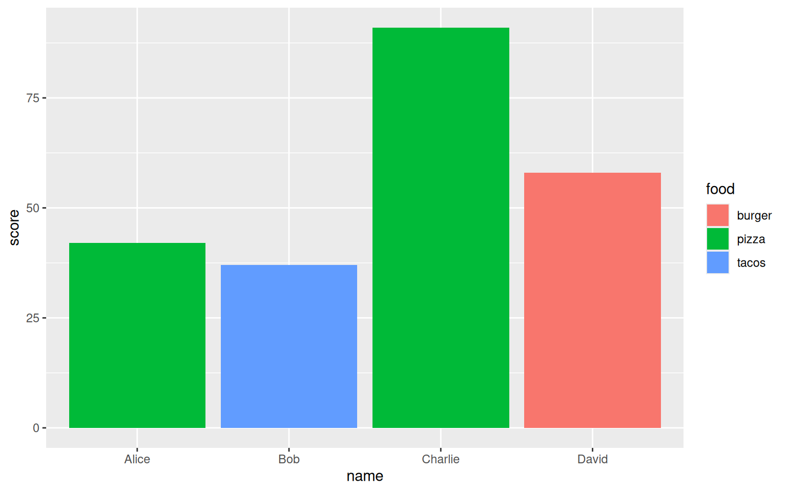
Now this fixes the “there’s no key” and “need to manually update colors manually” problems, but now the colors are randomly chosen by ggplot instead of by us!
To set them ourselves, we can use the “scale_fill_manual” tool to define what colors we want to be assigned to each type of food. This also takes a vector, and for simplicity (also so it can be reused in the code), I’ve split it into its own variable.
ColorCode = c("pizza" = "blue", "tacos" = "red", "burger" = "green")
ggplot(data=FullData, aes(x=name, y=score, fill=food))+
  geom_col()+
  scale_fill_manual(values=ColorCode)
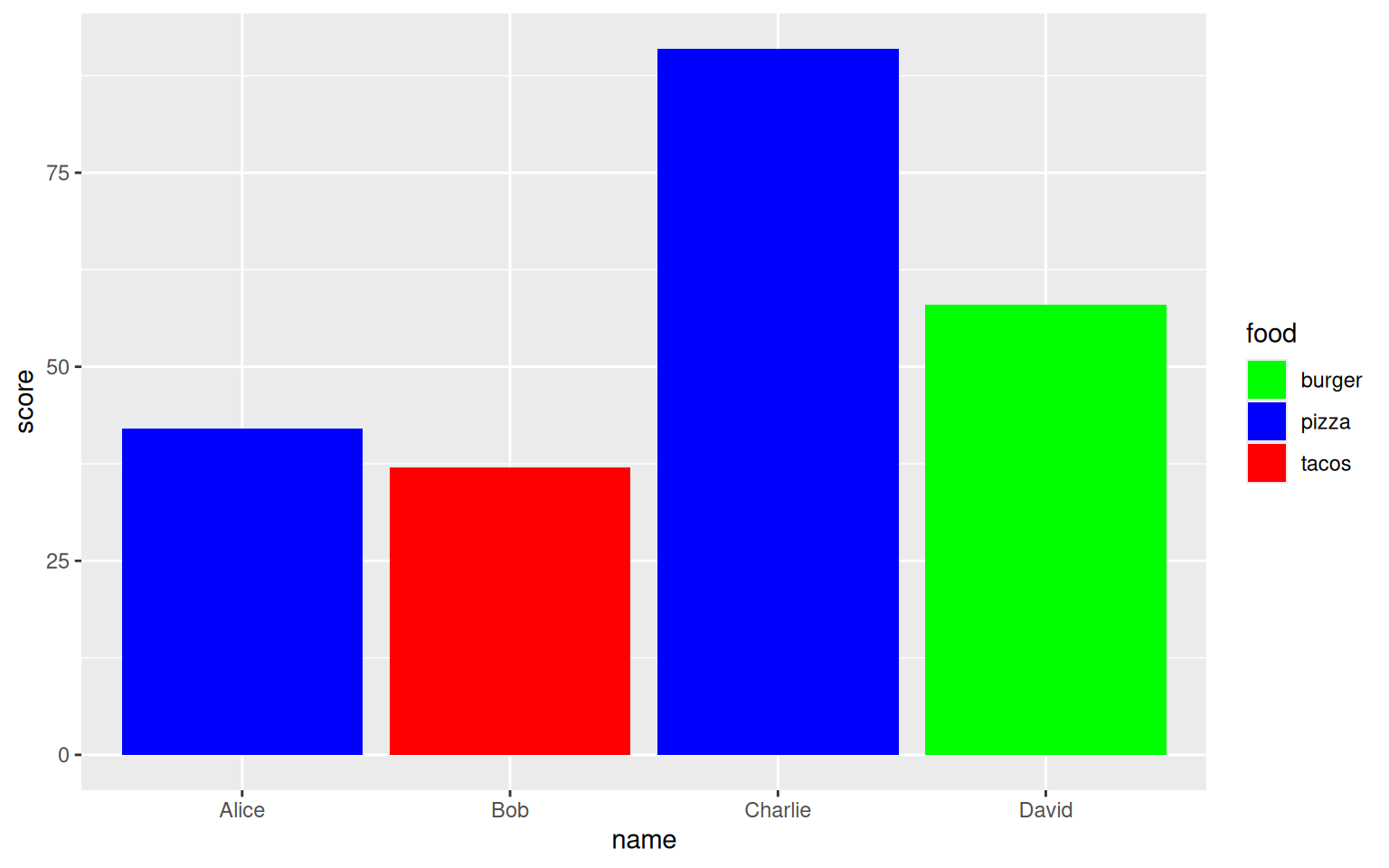
This is about as good as we can get it to be for now. Of course if this graph were to be presented, you should fix up the axes titles and do some light theming, but the core of these features can be applied to any graph you want to!